Let's cut to the chase: turquoise and teal are not the same color. Most people get them mixed up, and honestly, I did too for years. You see a cushion, a wall paint, or a piece of jewelry and think, "Is that teal? Or is it turquoise?" The confusion is real because they live in the same vibrant neighborhood of blue-green. But spend a decade working with colors and gemstones, and the differences become as clear as day. One is a specific, historical gemstone color with roots in the earth; the other is a modern, man-made name for a sophisticated design shade. This guide will not only show you how to spot the difference instantly but also explain why it matters—whether you're buying a gemstone, choosing a paint, or building a brand.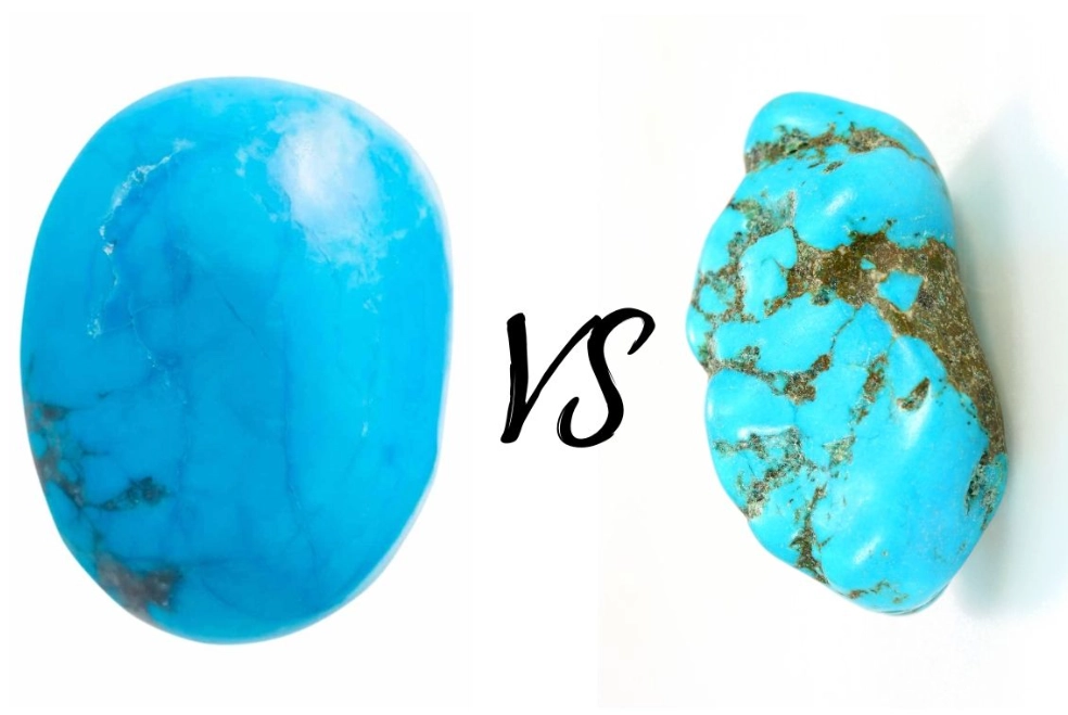
What You'll Learn in This Guide
What is the Core Difference Between Turquoise and Teal?
Think of it this way: Turquoise is a color named after a stone. Teal is a color named after a bird. That origin story tells you everything about their personality.
Turquoise the color directly references the average hue of the turquoise gemstone—a blue that leans distinctly towards green, but usually remains brighter and slightly more saturated. It's the color of shallow tropical water. The gemstone itself has been mined and prized for millennia, from ancient Egyptian tombs to Navajo jewelry, giving the color a sense of history and organic warmth.
Teal, on the other hand, is darker, deeper, and more balanced. It's named after the common teal duck, which has a striking dark greenish-blue stripe around its eyes. Teal has more green in it than standard cyan, but it carries a significant gray or black undertone that makes it feel richer, more subdued, and more modern. It's a created color term from the early 20th century, often associated with elegance and depth rather than earthy vibrancy.
The Quick Visual Rule: If the color reminds you of a bright, sunny day by a Caribbean sea—that's leaning towards turquoise. If it feels like the deep, mysterious water of a forest lake at dusk—you're probably looking at teal.
The Technical Breakdown: RGB, HEX, and Perception
Where the rubber meets the road is in the numbers. Designers live by codes like HEX and RGB. Here’s where you can really see the split.
| Color Attribute | Turquoise (Typical) | Teal (Typical) |
|---|---|---|
| Primary Impression | Brighter, warmer, more "greenish-blue" | Darker, cooler, more "bluish-green" with gray |
| HEX Code | #40E0D0 | #008080 |
| RGB Values | R:64 G:224 B:208 | R:0 G:128 B:128 |
| CMYK for Print | C:71% M:0% Y:7% K:12% | C:100% M:0% Y:0% K:50% |
| Closest Pantone* | Pantone 15-5519 TCX (Turquoise) | Pantone 17-4919 TCX (Teal) |
| Color Temperature | Leans Warm | Leans Cool |
*Pantone is a standard color system used in design and manufacturing. These codes are a reliable reference, but screens vary.
Notice the RGB for teal (0,128,128). The equal parts of green and blue, with no red, create that balanced, deep tone. Turquoise has a blast of green (224) and blue (208), but also a shot of red (64), which adds a tiny hint of warmth that pure teal lacks.
How to Tell Turquoise and Teal Apart in Real Life
Forget the codes for a second. How do you train your eye? The biggest mistake I see is people judging based on a single object under bad lighting. Context is king.
Put them side by side. This is the only foolproof method. A teal sofa might look "turquoise-ish" until you place a real turquoise gemstone next to it. Suddenly, the sofa appears darker, grayer, and more formal.
Check the lighting. Turquoise can look washed out and paler in bright, cool LED light, mimicking a pastel. Teal holds its depth better. Under warm incandescent light, turquoise glows with its greenish energy, while teal can look almost navy.
Here’s a real-world scenario: You're picking a color for your home office. You want something calming but not sleepy, sophisticated but not cold.
- Choose Turquoise if the room gets tons of natural light and you want an energetic, creative, uplifting vibe. It pairs amazingly with warm woods and neutral beiges. It can feel casual and friendly.
- Choose Teal for a north-facing room or a space where you want a sense of focused calm and depth. It works brilliantly as a feature wall behind a dark wood desk, with brass or gold accents. It feels more formal, more "adult."
I once advised a client who was furious because the "teal" accent wall she painted looked "baby blue" in the afternoon sun. She'd actually used a turquoise-leaning paint. We repainted with a true, deeper teal (adding more black base), and the problem vanished. The color now looked consistent and rich all day.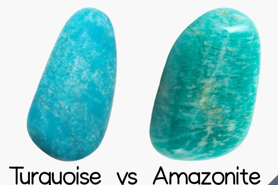
Turquoise as a Gemstone: Beyond the Color
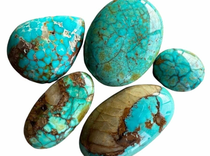
This is where the turquoise vs teal conversation gets concrete. When we talk about "turquoise" in jewelry, we're talking about an actual mineral: a hydrated phosphate of copper and aluminum. Its color isn't just a paint swatch; it's caused by traces of copper (creating the blue) and iron (adding green).
Natural turquoise exists on a spectrum from pure sky blue to strong greenish-blue. The most valued color is an intense, even, medium sky blue, often called "Persian blue" in the trade, referencing high-quality historical Iranian sources. A greenish turquoise is just as genuine but often (though not always) commands a slightly lower price per carat.
Key Gemstone Properties:
- Hardness: Relatively soft, 5-6 on the Mohs scale. This means it can be scratched by everyday dust (which contains quartz, hardness 7).
- Treatments: Most turquoise on the market is stabilized. This means it's been infused with a plastic resin to harden it and enhance its color. It's a standard, accepted practice for making the stone durable enough for jewelry. Natural, untreated "high-grade" turquoise is rare and expensive.
- Major Sources: The Southwestern United States (Arizona, Nevada), Iran, China, and Egypt. Sleeping Beauty turquoise from Arizona is famous for its pure, robin's-egg blue color with no matrix.
So, when you see "teal jewelry," it's almost always referring to the color of the metal or enamel, not the gemstone. You wouldn't call a gemstone "teal." You might describe a particular turquoise stone as having a "greenish-blue" or "teal-like" hue, but the official name remains turquoise.
Using Turquoise and Teal in Design: A Practical Guide
Knowing the difference lets you use each color with intention. Here’s how they play out in different fields.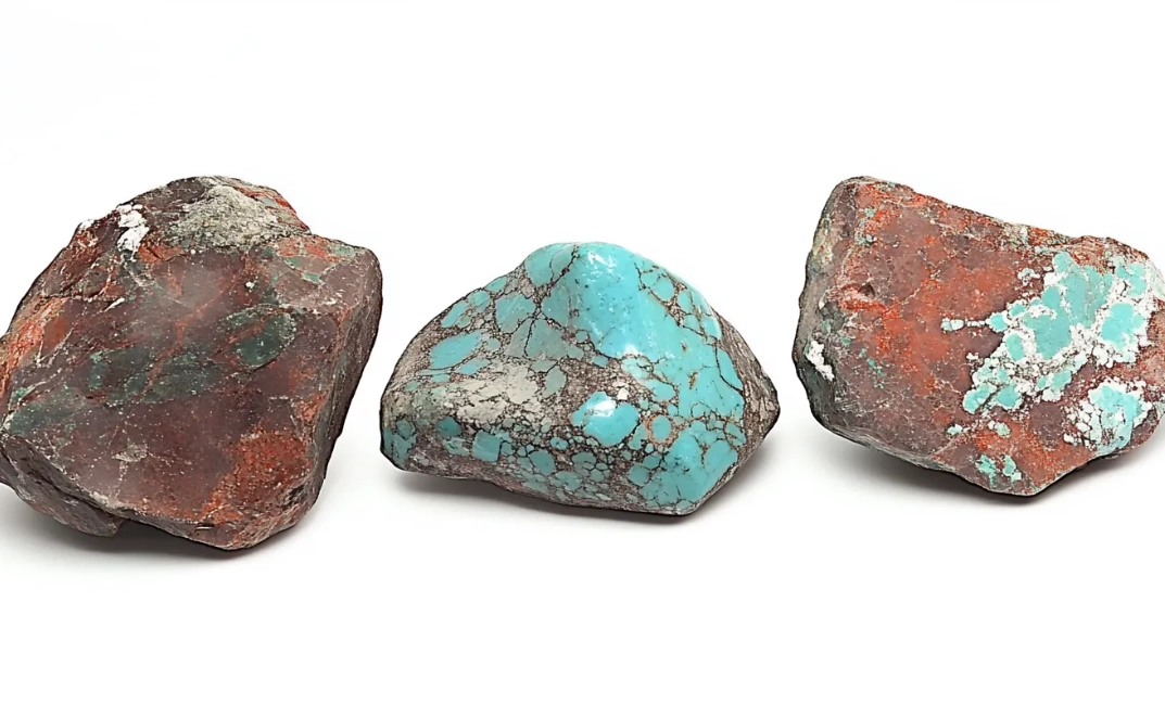
Interior Design & Home Decor
Turquoise is your go-to for spaces that need a shot of joy. It's fantastic in bathrooms, beach houses, sunrooms, or as pop colors in kitchens (think tile backsplashes or small appliances). It feels youthful and global. Pair it with coral, peach, or mustard yellow for a vibrant, bohemian look.
Teal is the choice for creating intimacy and luxury. Use it in libraries, studies, master bedrooms, or dining rooms. It's a stunning color for velvet upholstery on a statement chair or sofa. Metallics are its best friend: rose gold, brass, and copper make teal sing. For a modern look, pair it with charcoal gray and crisp white.
Branding and Web Design
This is critical for your logo and website. Colors send subconscious messages.
- A Turquoise Brand communicates creativity, approachability, clarity, and energy. Think of brands like Tiffany & Co. (their iconic box is a specific shade called "Tiffany Blue," which is closer to turquoise than teal), or some health and wellness apps. It says "friendly and innovative."
- A Teal Brand signals stability, sophistication, trustworthiness, and depth. It's common in financial tech, consulting firms, and luxury goods. It says "reliable and upscale."
If you're designing a website, using teal for headers and footers can ground the page, while using turquoise for call-to-action buttons can make them stand out in a welcoming way.
Fashion and Personal Style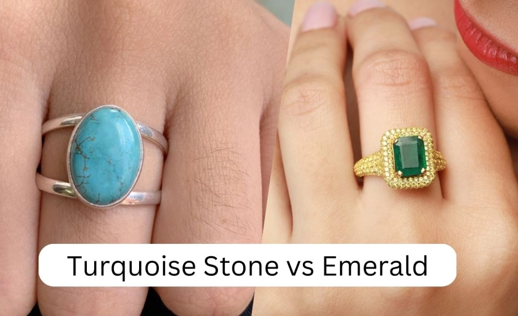
Turquoise clothing is bold and summery. It works best for people with warm or olive undertones in their skin. A turquoise dress or shirt is a statement piece.
Teal is surprisingly versatile and flattering on most skin tones because of its depth. A teal blazer, coat, or pair of trousers is a classic wardrobe staple that reads as elegant and intentional, not trendy. It's a color you can wear year-round.
Common Myths and Expert Insights
Let's bust some myths I hear all the time.
Myth 1: "They're basically interchangeable." No. As we've seen, they have different formulas, histories, and psychological impacts. Using one when you intended the other can throw off an entire design palette or make a piece of jewelry look "off."
Myth 2: "Teal is just dark turquoise." This is the most common technical misunderstanding. It's not just about lightness/darkness (value). It's about hue and saturation. Teal has a different hue balance (more green-blue equality) and lower saturation (more gray) than even a dark turquoise. A dark turquoise still retains that greenish-blue vibrancy.
Myth 3: "All turquoise gemstones are the same blue." As a gemologist, this one hurts. The natural variation is immense. The American Gem Trade Association provides detailed grading guidelines that account for hue, tone, and saturation. Relying on a single image online is a recipe for disappointment when your stone arrives looking greener or darker.
My non-consensus take? The rise of digital screens has made us worse at distinguishing these colors. We're trained to see millions of colors in isolation, not in relationship to each other. The best thing you can do is create a physical color swatch library for yourself—paint chips, fabric samples, even magazine cut-outs—and train your eye offline.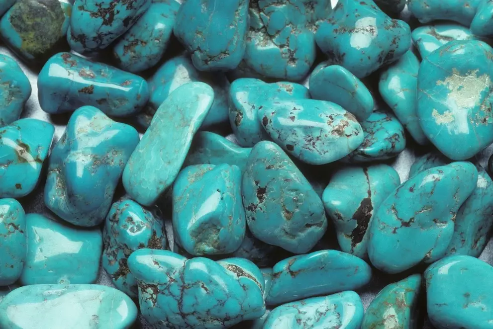
Your Questions Answered
Why do my turquoise walls look different in photos than in the store?
I'm buying a turquoise ring online. How do I ensure I get the blue color I want, not a green one?
 Can I mix turquoise and teal in one room, or will it clash?
Is teal considered a warm or cool color?
How do I care for my real turquoise jewelry to keep its color?